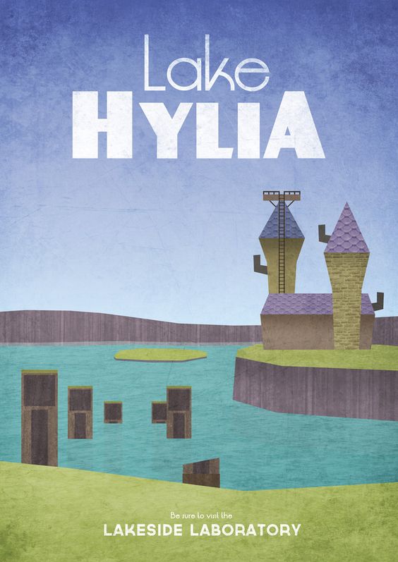
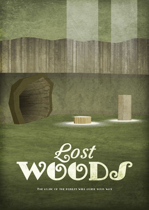
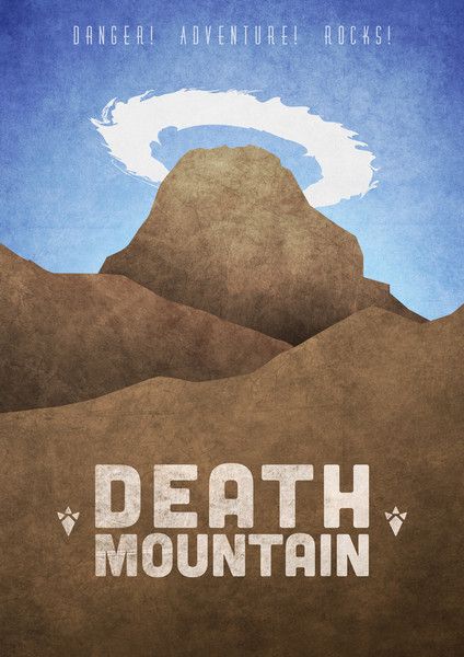
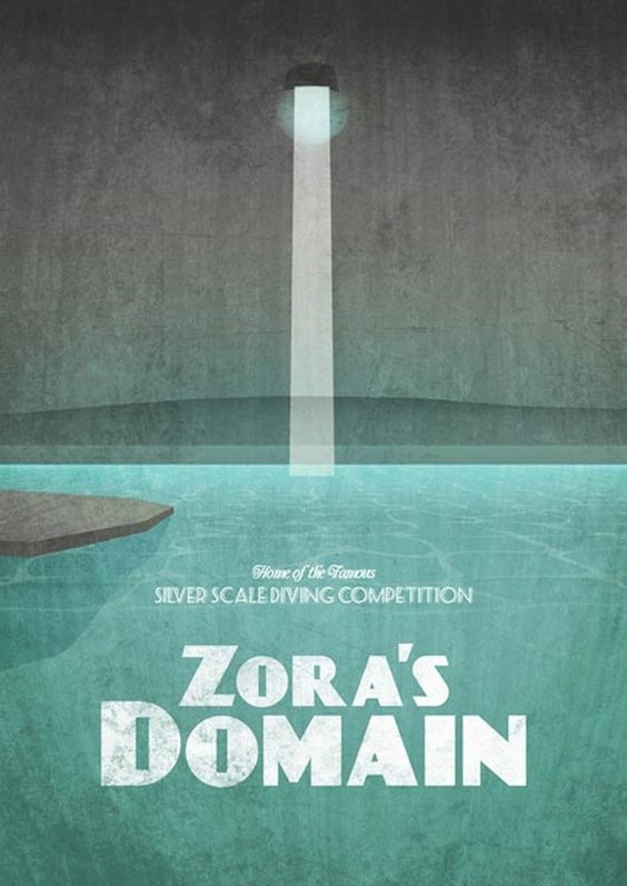
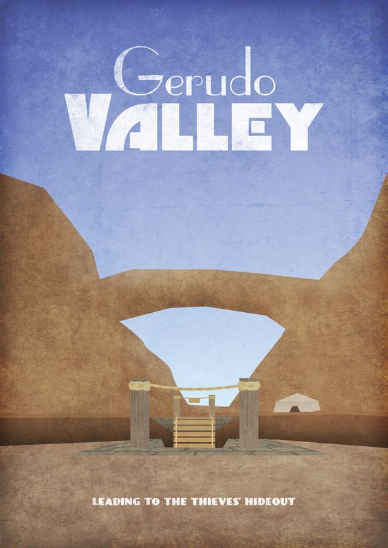
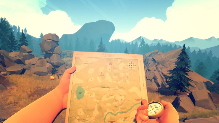
I have recently discovered these beautiful posters by Dean Walton, a UK based graphic designer.
Whilst he designs posters for many different videogames, these Legend of Zelda ones are my personal favourite. I love the old-school style with the distressed texture and the choice of colours fits so well with each location in the game. I also like how they were created to be like real travel posters, as if you could visit these fictional places.
These posters (along with others) are available to buy in A3, A2 and A1 size from here
Hello! I have recently started a new blog at www.natashawarddesign.wordpress.com to showcase my personal design work. Please check it out if you are interested. Thanks!
The relationship between nature and art has interested scientists, mathematicians and philosophers for hundreds of years. More recently, patterns of nature in design have been in and out of fashion. At the turn of the 20th century, using natural patterns was seen as quaint and old fashioned, with Art Nouveau falling out of fashion. In reaction to Art Nouveau’s elegance and emotions, Avant Garde artists combined their organic flowing patterns with strong angular shapes creating a hybrid of the two. Eventually, these natural shapes were seen less and less to the point where they had almost been eradicated.
Over 100 years later, botanical patterns have started to return to mainstream design. This is largely due to computer technology allowing designers to create these patterns with ease. It has also become a distinctive way to add personality to a brand and separates itself for more modernist designs. Adding these natural elements can make a brand seem more human.
This typeface created by Antoine+Manuel is a beautiful example of a typeface which combines strong letterforms with flowing organic elements. The ‘branches’ extending from the letters gives a distinct natural element to something normally seen as refined and precise.
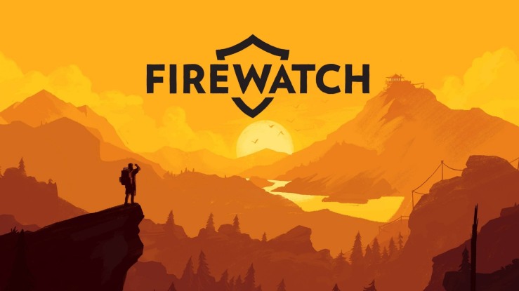
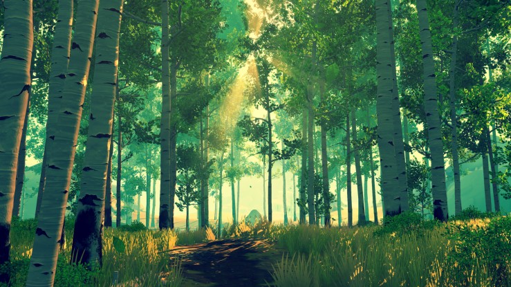
Firewatch is a first person mystery game set in the Wyoming wilderness. It deals wth the main character, Henry, using his new career as a fire warden in order to escape troubles from his past. However, working in isolation with only a voice on the radio to talk to, brings new problems and a sense of unease when Henry realises all is not right in the forest.
The artwork of this game really stood out for me. From it’s simple, realistic logo to it’s beautifully lit scenes of the forest. I have never played a game that has so successfully used colour to evoke emotion. The blue skies and fresh earthy colours at the beginning of the game portray a sense of adventure and relaxation. These slowly make way for more nighttime/dusk scenes when the mystery intensifies giving a sense of fear and vulnerability.
The art style is very minimal and uses gradients of block colours to build up the scene. It creates depth and gives the impression that there’s a huge forest to explore. Along with reminding the player how alone they really are.
Manifestos are published declarations of intents, motives and views of a group of people. It builds on a previously published idea and presents its own take on the situation. They are often political or artistic in nature but can depict an individual’s life stance.
One of the first artist manifestos was created in 1909 by Filippo Marinetti. It first appeared as a preface to one of Marinetti’s poems. It explained the concept of Futurism, what the movement stood for and it’s celebration of speed, war, violence and technology. Graphically, it was in the style of a newspaper; a bold headline with narrow columns of text. It was completely black and white.
Futurist Manifesto by Filippo Marinetti (1909)
Futhermore, two Surrealist manifestos were issued by the Surrealist movement in 1924 and 1929. Both were written by Andre Breton, the first being published in a small booklet. He described Surrealism as:
“Psychic automatism in its pure state, by which one proposes to express — verbally, by means of the written word, or in any other manner — the actual functioning of thought. Dictated by the thought, in the absence of any control exercised by reason, exempt from any aesthetic or moral concern.”
The text included many examples in art and poetry but explained the idea could be applied to all aspects of life. It concluded that Surrealist activity followed no set plans or patterns and that the Surrealist were essentially nonconformists.
More recently, Ken Garland published First Things First in 1964. It was published in the Guardian newspaper and received the support of over 400 designers and Tony Benn, radical left-wing MP. The manifesto was a reaction against the rich and affluent Britain of the 1960s, arguing the design industry had become lazy and uncritical. The supporters of First Things First believed design could never be neutral or value-free, that designers put their personal opinions into their work. It was against consumerist culture and try to highlight the Humanism within graphic design. In 2000, it was republished by Adbusters magazine and signed by a further 33 international graphic designers. It’s aim was to regenerate discussion about the idea of value-free design in today’s society.
First Things First (2000)
Overall, a design manifesto is a statement of beliefs. It highlights a way of working, an opinion on the development of design. This is achieved by a short, powerful statement. In terms of design, often they are published purely in monochrome and favour black-on-white typography as a way of expressing seriousness and importance. Ironically, many look like pamphlets with a simple design and lack of colour. The design of the manifesto has to adopt the styles of its many supporters, thus a neutral design is more applicable and less likely to cause arguments.
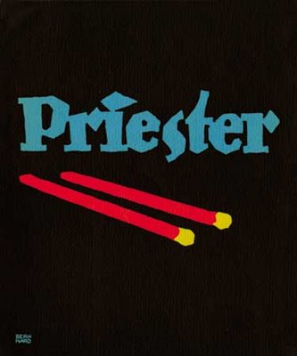
Sachplakat, also known as Plakatstil, originated in Germany as an early style of poster design. The advent of chromolithography during the late nineteenth century saw a shift in the form and content of advertising posters. Due to the new technology of colour images, artists had begun to develop looser styles, depicting colourful detailed figures surrounded by artful lettering. This inspired a reaction to complexity and lead to the emergence of a more simplified style. Designers and artists wanted their work to be easy to read for passersby. The common characterises of Sachplakat are bold lettering with flat colours, simplified shapes and objects, and the composition focusing on the central object. It was in contrast to Art Nouveau which featured a strong decorative element and detailed typography. Sachplakat aimed for a more modern look of poster. The inventor of Sachplakat was an 18-yr-old German cartoonist, Lucian Bernhard. In 1906 he entered a competition sponsored by Berlin’s Priester match company. It is rumoured that his first sketch was rejected by the company. It was typically Art Nouveau and featured a cigar in an ashtray on a checked tablecloth with dancing nymphets seen in the cigar smoke. Next to the ashtray were two wooden matches. After the rejection, and inspired by a friend, he rethought the composition. He removed everything from the design except the two match sticks. He enlarged them, changed their colours to red and yellow and added text. He hand-lettered the brand name ‘Priester’ in bold block letters. The object poster remained popular until WWI brought commercialism to a halt. Sachplakat lost it’s value after the war as new techniques and styles were emerging. However, it still remains influential in poster design today and shares many characteristics with Modernism.
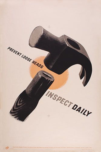
Priester Matches by Lucian Bernhard (1906)Prevent Loose Heads Inspect Daily by Tom Eckersley (1947)Opel automobiles by Hans Rudi Erdt (1911)
Graphis Diagrams (Issue number 165) was a book created in 1974, edited by Walter Herdeg. Herdeg had an interest in the scientific side of graphic design and created this book full of diagrams and abstract data graphics. It had a noticeable square format which differed from the usual rectangle size of the magazine. The square remains a symbol of modernity and the modern world.
“The purpose of this book is to show the designer how abstract facts or functions which cannot be simply depicted like natural objects may be given visual expression by suitable graphic transformation.” – Walter Herdeg.
The book gives the reader a deeper insight to the data collected whilst displaying it in a modern and highly artistic way. It helps explain abstract concepts, using diagrams to make them understandable.
Ver Sacrum, latin for ‘Sacred Spring’, was an Austrian magazine published between 1898 and 1903. It was a magazine created by the Vienna Secession, a group of artists who had resigned from the Association of Austrain Artists. Whilst it was short-lived, it was extremely influential to artists and designers.
The magazine had pioneered new techniques in graphic design, such as modular groups and creative typography. It was widely known for it’s use of a square format which was largely unseen before. Ver Sacrum covered all works of art in one magazine, making even the most ornamental designs look economical. In the first two years the magazine was published monthly and primarily to members of the group. From the third year onwards it was published only twice a year.
The magazine included contributions by artists and writers such as Rainer Maria Rilke, Arno Holz, Maurice Maeterlinck, Knut Hamsun, Hugo von Hofmannsthal, Otto Julius Bierbaum, Richard Dehmel, Conrad Ferdinand Meyer, Josef Maria Auchentaller and Ricarda Huch.
The book has an interesting page layout, one that still looks modern today.
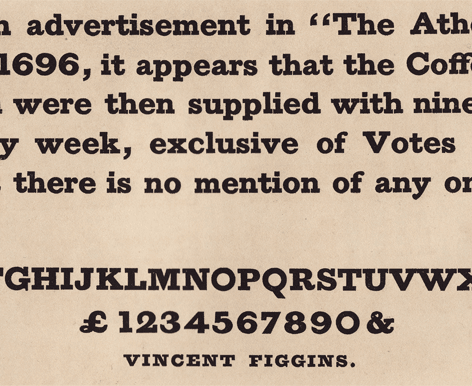
Vicent Figgins was a British punch-cutter and type founder born in Peckham. His career started as an apprentice to Joseph Jackson in 1782. Upon Jackson’s death, Figgins was expected to become the new owner of his type foundry. However, due to financial reasons, the foundry was bought by William Calson III. A friend of Jackson’s encouraged Figgins to open his own foundry, believing in the quality and successfulness of his work. Figgins became very successful with his new foundry and was grateful for the original encouragement.
Figgins retired from the foundry in 1836, leaving the business to his two sons who later shared in it’s success. Vincent Figgins died in 1844 at the age of 77.
The most successful work of the foundry was the design of ‘Antique’, the first slab serif typeface released in 1815. However, at the time, the typeface received a negative reaction from the public, being too different from the current typefaces used at the time. Although, it was liked by some and critics have said the typeface was brilliant.
The typeface is no longer seen as outrageous today but is now an important part of type design history.
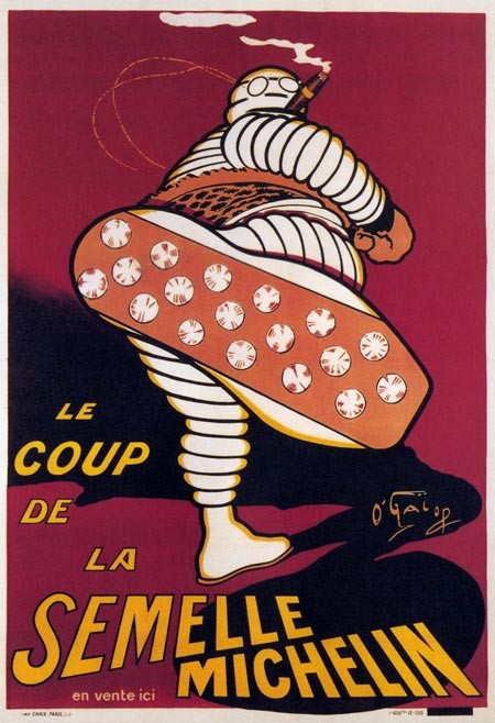
A shift in the late nineteenth century saw a rise in the use of images over text. The reproduction of images became cheaper and this allowed brands to explore the use of characters in their logos, when they had once relied solely on business names and clever slogans. The mascot, often appearing human like in personality, was used to gain the public’s trust and to renew the brand.
Bibendum, the Michelin Man is a good example of a mascot used for a tyre company. It was first introduced in 1894 at the Lyon Exhibition, where the Michelin brothers had a stand to promote their business of selling tyres. Bibendum has become one of the oldest pictorial trademarks.
The idea for Bibendum was first thought of when Edouard Michelin noticed a stack of tyres and it’s similarity to a man without arms. Later they met with French Cartoonist, O’Galop who designed the character based on a previously rejected design for a brewery.
From 1912, carbon was added as a preservative and strengthener to tyres. This turned the tyres a black colour when before they had been grey-white or beige. The brothers experimented with changing the colour of Bibendum for a few print posters but he was quickly returned to his previous state because of printing and aesthetic issues.
Bibendum’s shape has evolved over time. The early mascot shows a plumper character smoking a cigar and wearing glasses. The first logo was based on bicycle tires. In 1980’s Bibendum was depicted as running and by 1998, he had been replaced with a slimmer version. This new slimmer version is to emphasis the lower-profile and smaller designs of today’s modern cars.